INFINI Health & Fitness Solution

OWN PROJECT
Product
Mobile & Web App
Industry
Health & Fitness
My Role
UX/UI designer, user researcher, brand designer, UX writer
Length
80 hours
Tools
Figma, FigJam, Google Suite, Notion, Maze, ChatGPT
Problem
In today’s fast-paced world, individuals face challenges in
managing their health comprehensively and efficiently. The lack of integrated, personalized, and accessible tools makes it difficult for people to monitor chronic conditions, improve mental health,adopt healthier lifestyles, and manage overall well-being conveniently
Solution
To address this need, the proposed app offers a comprehensive health and wellness management platform that empowers users to monitor and manage their physical and mental well-being. By integrating personalized features, the app ensures accessible and holistic support for improving overall health.
Design Process
1. Discover
• User Research
• Affinity Map
2. Define
• POVs/HMWs
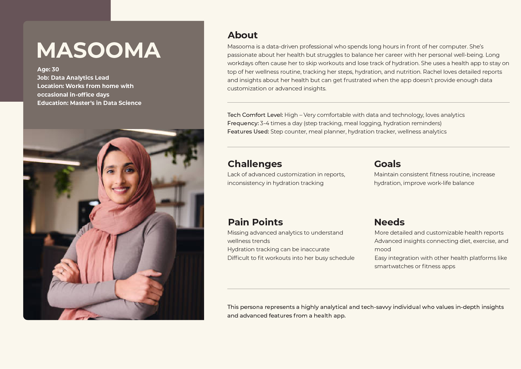
• User Persona
• Feature Set
• Sitemap
• Task Flow
• Low-fidelity Sketches
3. Develop
• Mid-fidelity Wireframes
• Logo & Branding
• UI Kit
• High-fidelity Wireframes
4. Deliver
• Prototype
• Usability Tests
• Iterations
1. Discover
Navigating the Landscape of Health & Fitness
User Research: Unveiling User Expectations
After an insightful conversation with working class, it was time to gain insights into the needs and preferences of potential customers. The objective is to uncover the fundamental elements that users genuinely desire in a website for home repair services.
Research Goal
Key Findings and Insights
• Market Differentiation: Each app has carved a niche in the wellness industry: MyFitnessPal in nutrition, Fitbit in activity tracking, Calm in mental wellness, and Apple Health in comprehensive data aggregation. However, there is an emerging demand for holistic apps that provide both mental and physical health tracking.
• Feature Gaps: Users are increasingly looking for integrated wellness solutions. For example, Calm lacks activity tracking, and MyFitnessPal does not offer in-depth mental wellness resources, leaving opportunities for apps that blend fitness and mental health.
• Opportunities for Integration: Apps that can integrate various health aspects (e.g., nutrition, activity, and mental wellness) and offer seamless data sharing across devices will likely see a competitive edge.
Key Research Questions
User Surveys:
• What health goals are most important to users (e.g., fitness, mental health, chronic condition management)?
• Which app features are most desired (e.g., fitness tracking, medication reminders, mood tracking)?
• How often do users engage with health apps and what features do they use most?
• What are the pain points of current health apps?
User Interviews:
• Why are users seeking a health and wellness app?
• What specific problems or challenges are they facing with their current health management?
• How do they prefer to track health-related data (e.g., manually, through wearables, etc.)?
• What would make them stay engaged with the app long-term?
Mapping the Journey: Affinity Magic
To make sense of the mosaic of insights, I crafted an affinity map in FigJam. It wasn't just about data; it was about spotting patterns, uncovering truths
Themes That Echoed Loud and Clear
- Reviews: Trust hinges on online reviews-a non-negotiable.
- Clarity: Clean layouts, concise information, and visual appeal win the day.
- Mobile Must-Haves: The majority wielded phones, underscoring the need for mobile compatibility.
- Communication: Direct contact speaks volumes, especially through calls and face-to-face meetings.
- Locality: A local touch and responsiveness to criticism build trust.
Armed with these revelations, the next phase was more than a step forward; it was a leap. I had not just heard but seen the user's script, laying the foundation for a digital experience that resonates with desires—both expected and pleasantly unexpected.
2. Define
Shaping Solutions with Purpose
Based on the affinity map and the user insights, here are the Point of View (POV) and How Might We (HMW) statements for the health app:
Point-of View Statement
1. For young IT professionals who are passionate about fitness, wellness, and maintaining a healthy work-life balance,
• The health app needs to provide seamless tracking across fitness, nutrition, and mental wellness because they
want a single platform that helps them manage their health and fitness goals in a streamlined and efficient way.
However, users often face challenges with syncing wearables, inaccurate food data, and complex app navigation,
which make it harder to stay consistent with their tracking.
2. For users who are highly concerned about data privacy and security,
• The health app needs to be more transparent about data handling practices and ensure robust privacy
measures because they want to feel secure and informed about how their health data is used.
However, there is a lack of clarity on how their personal data is stored and shared,
which leaves them feeling uncertain about privacy.
3. For users who struggle to maintain consistent app usage due to external factors (e.g., vacations, stress, work),
• The health app needs to offer personalized reminders and flexible tracking options that encourage more
consistent usage and help users stay motivated, even when they are away from their routine.
However, users often face inconvenience in logging activities and reminders are not prominent, causing them to
abandon the app temporarily.

Future-Proofing with Features: A Glimpse Forward
Peering into the future, I outlined a feature set. Essential elements included robust review capabilities, a quote request form, and a comprehensive overview of Infini's services. Anticipating growth, potential features like a customer portal, online booking, and integrated payment systems were also envisioned.

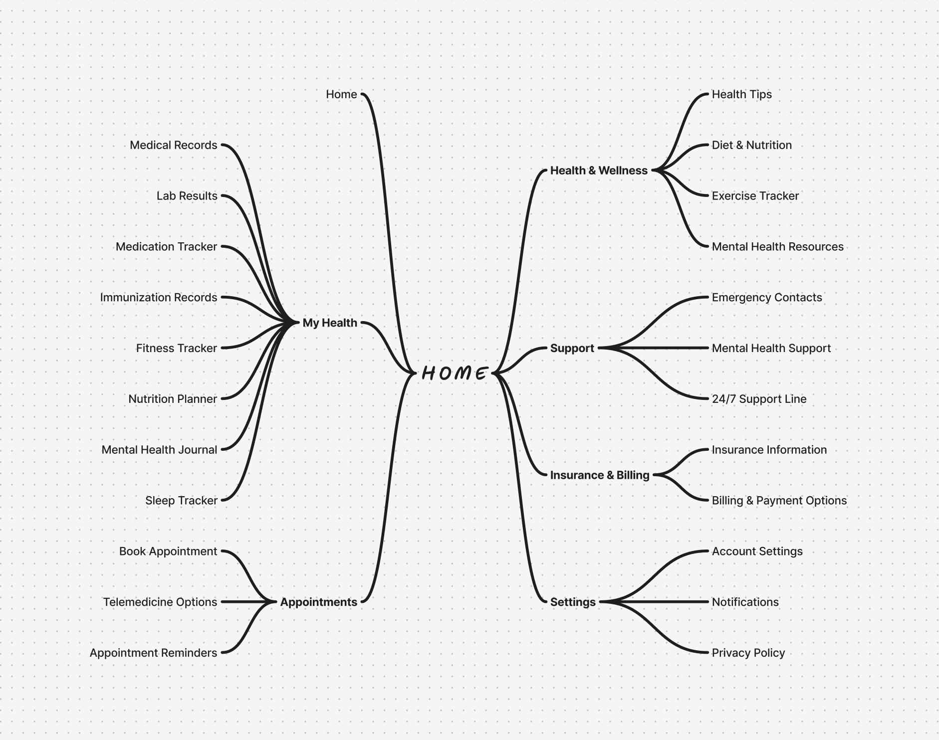
Structuring the Terrain: Sitemap Strategies
To navigate the user seamlessly, I structured the website content into a sitemap. Simplicity was the compass, ensuring easy navigation without overwhelming complexity. Reviews were prioritized for swift access.
Navigating the User Narrative: Task Flow
In collaboration with the client, a tailored task flow emerged. The focus? A review system allowing both positive and negative customer experiences to be shared. Transparency was the key, echoing the user's desire for unaltered insights. This flow, meticulously crafted for desktop and mobile users, became the gateway to honest testimonials.

3. Develop
From Wireframes to a Seamless User Experience
Transforming Ideas into a Digital Tapestry: Mid-fidelity Wireframes
In the heart of Figma, my vision came alive. Mid-fidelity wireframes emerged, translating sketches into tangible screens that hinted at the digital journey ahead. The collaboration with the client infused excitement into the evolving canvas of Infini's Health & Fitness online presence

Brand Essence
A pivotal moment was the birth of the logo—a fusion of repair tools forming the capital letter H. This became more than a mark; it symbolized Henderson’s essence. From sketches to digitized concepts, the final logo and brandmarks stood tall, ready for a prominent place in the digital and print realms.

Infusing patriotism into pixels, we chose a deep, trust-inducing blue as the main hue, complemented by vibrant gold/yellow for quality and a touch of red for an exciting pop. This palette echoed professionalism, trustworthiness, and a dash of excitement. The font, a sleek sans serif, maintained simplicity and professionalism.
UI Kit: Key Components
As with all digital products with repeating elements, I created components in Figma to save time. Below is a snapshot of the most important components created, including logo variations, icons, navigation menus, and review cards.

High-fidelity Elegance: A Symphony of Colors and Text
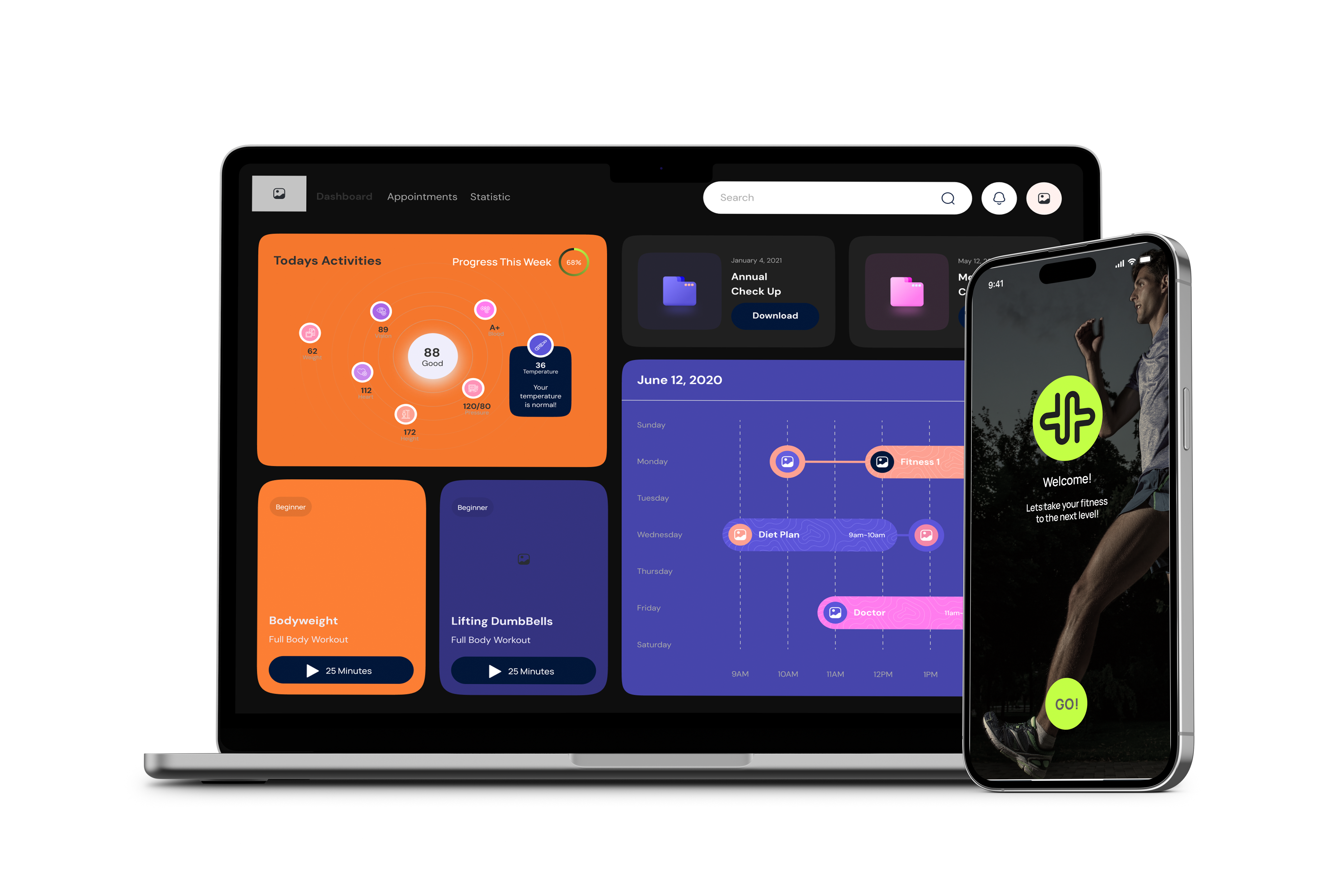
The transition to high-fidelity wireframes marked the growth of the visual journey. Colors, fonts, logos, and UI components converged to birth fully-freshed screens for both desktop and mobile. For review writing, the text copy became a focal point—I wanted the tone to be clear, professional, yet conversational and friendly. Every pixel was a brushstroke, enhancing the writing experience for users.

4. Deliver
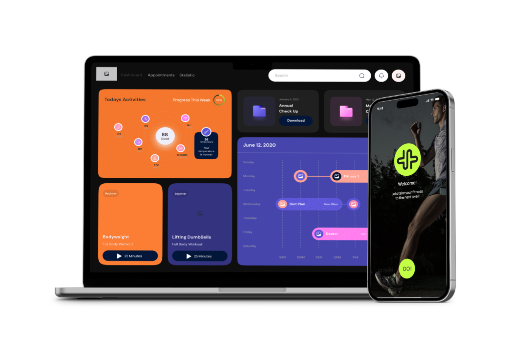
Unveiling Infini Health & Fitness App
In this phase, I transitioned from ideas to reality, showcasing Infini Health & Fitness in its full form.
High-fidelity Prototype: Making it Work
I transformed the detailed wireframes into a working prototype using Figma. The GIFs below demonstrate the user journey

Usability Tests: User-Tested, User-Approved
With the prototype ready, it was time for usability tests with real participants. Due to a quick turnaround, I conducted unmoderated tests on Maze. Two tasks: write a review on desktop and write a review on mobile. There were seven total participants
Desktop Findings
- 100% direct success
- 94.3s average duration
- 100% 5-star ratings
User Feedback
- Overall, the task was very easy, simple, and straightforward.
- One participant suggested putting more color into the logo, breaking away from an all-black design.
“I love how clean and minimalistic your design was and the path to the reviews came very intuitively.
– Participant
Mobile Findings
- 100% direct success
- 55.5s average duration
- 100% 5-star ratings
User Feedback
- Again, the task was overall very easy and straightforward to complete.
- Two participants highlighted their enjoyment of the writing guide option.
“I liked the options for how I’d want my name to be displayed and the offer for a guide to help write the review the site looks super legit and professional.”
– Participant
The usability tests were a smashing success with no major issues, just minor cosmetic suggestions. This led to the decision to change the logo color from black to navy blue, aligning with the overall color scheme.
Wrap Up
A short screener survey paved the way for targeted interviews. The criteria were simple:
In conclusion, this health and fitness app design journey was driven by user-centric research, strategic design thinking, and iterative testing. By understanding the real needs, pain points, and motivations of users, we created an intuitive, visually appealing, and goal-oriented solution that encourages consistent engagement and supports a healthier lifestyle.
Our process emphasized simplicity, motivation, and accessibility, resulting in a user experience that makes achieving fitness goals enjoyable and empowering. This case study highlights the importance of user feedback, continuous improvement, and a holistic approach to design that prioritizes both functionality and visual aesthetics.
Lessons Learned
• Throughout this project, we learned that understanding user needs, motivations, and pain points is crucial for designing an effective health and fitness app. Key takeaways include:
• Simplicity Matters: Users prefer a clean, intuitive interface that makes tracking fitness progress easy and engaging.
• Motivation is Key: Features like goal-setting, reminders, and rewards drive consistent app usage and user engagement.
• User Feedback is Essential: Usability testing highlighted areas for improvement, reinforcing the value of incorporating user feedback early and often.
Impact
Our design decisions resulted in a user-centric app that fosters healthy habits and supports users in achieving their fitness goals. The key impacts include:
Improved navigation flow, making it easy for users to log workouts and track progress.
An engaging experience that motivates users to stay consistent with their fitness routines.
Enhanced visual feedback and micro-interactions, creating a sense of accomplishment for completed tasks.
Next Steps
• To further optimize the app, we plan to:
• Conduct additional usability testing to validate recent improvements and identify any remaining pain points.
• Introduce a Barcode Scanner for Calorie Counting feature, allowing users to scan food items and seamlessly track their daily calorie intake.
• Explore advanced features like personalized workout recommendations and progress-based incentives.
• Collaborate with developers to ensure a smooth transition from design to development and maintain a user-centric focus throughout the implementation process.

